Tech, Tips, and Tutorials.
Reviews, News, and Rants.

The Mouse Turns 40 Today

Happy Birthday to our humble little mouse. It’s hard to think that that little bit of hardware has been alive for forty years now.

Most hardware in use 40 years ago (keyboards excluded) has been completely phased out. Yet, despite it being so old, I can’t think of many more efficient, cost-effective, and accessible ways to access a computer.

We might soon have touch-screen computers and voice-commands – but I think the mouse is here to stay a good bit longer!

[The computer mouse turns 40 – via Macworld]
photo from funnyphotos.net.au

Continue Reading

2 Reasons Why Reading Tech Blogs Makes you a Better Citizen

After spending years reading tech blogs - like Gizmodo, Engadget, and TechCrunch, I’ve come to the conclusion that: reading tech blogs makes you a better citizen.

Here’s 2 reasons why:

You do your bit for Environment

Being a tech-reader,  you’re always updated with the latest gadgets, trends, memes, etcetera. You also get a nice, healthy dosage of eco-friendly stuff. From human-laptop chargers, electric bikes, electric car reviews, and so forth.

In addition, many of the tech blogs promote DIY projects and recycling (or re-purposing) of old hardware. It’s all good for tree huggers.

You do your bit for the Economy

Having said all that, you’re also likely to do your bit for the economy. Tech-readers are also likely to be gadget-lovers, always wanting the latest and greatest toys to play with – many of which are not cheap.

2008’s Black Friday was covered in more detail than any Black Friday I can remember. The tech blogs spent weeks posting about special Black Friday deals to entice readers to spend their money – and give the economy a boost.

With the Great Economic Crisis (TM) of 2008, it was encouraging to see so many people still flocking to the stores at dawn on Black Friday. This was no doubt (in part) due to the extensive coverage retailers enjoyed from tech blogs.

So there you have it, two convincing reasons why we should all continue reading our tech blogs — carry on.

photo credit: sxc.hu: 1, 2, 3
Continue Reading

10 Tips to get Extra Juice out of your Laptop’s Battery

Spending hours and hours in University everyday, time and again I find myself craving a plug to charge my laptop from near-death.

It’s a terribly frustrating thing to see you computer lose power in front of your very eyes, forced to return to the arcane method of taking notes, pen and paper. It’s all very much last century.

Over time I’ve developed a few tactics to help me limp through a full day on a single charge. They may help you too (note: I’m using Windows Vista, which has a couple of power-saving features over XP).

Switch Profile to Power Saver
Perhaps the most obvious switch would be to switch the power profile. To do this, click once on the button in the system tray and select Power Saver from the list that appears.

Lower Display Brightness
Another obvious one. A bright LCD, while nice-looking, costs dearly in terms of power drain. Most laptops have keyboard commands to reduce the brightness.

Sleep Instead of Shutdown (Vista-only)
This is an important one. Whatever you do, don’t shutdown your computer. The time it takes to start up, and the power it needs to do so means that you typically lose around 5-8% charge just from a single restart. Sleeping is much more efficient. You can get back to work instantly. Sure, you lose a tiny amount of charge over time, but it’s more worth it. This is a Vista-only feature. XP users can try standby to see how that works.

Turn Off Wi-Fi, Bluetooth, and Other Wireless Connections
Unless you absolutely need it, I found that turning off the Wi-Fi receiver increased battery life considerably. I got an extra half hour just by turning it off. The same holds true for other wireless connections, like Bluetooth, just to a lesser extent. Once again, most laptops have switches somewhere on the casing to turn on/off the wireless receivers.

Remove USB Devices
USB devices, like pen-drives, and mice draw power. Remove them, simple as.

Lighten the Processor’s Workload
The processor takes up the most power, and so you’d want to ensure it isn’t working too hard. There are 2 ways to ensure you’re not straining your CPU too much and the benefits are huge.

Firstly, the obvious stuff. Avoid graphics-intensive programs like games, and keep as few apps open as possible. I typically keep just a word processor open in class.

Secondly, there is actually a software switch to restrict your CPU’s power usage. To access it, click on the battery indicator in the taskbar, and click More power options. Then, under Power Saver, click to Change plan settings. Finally, click to change the advanced options. Find Processor Power Management to alter the minimum and maximum processor states.

I typically keep it at a minimum of 40% and a max of 75%, but I’ve successfully taken the levels even lower. Be careful though, because setting it too low will cause the laptop to crash. Either way, prepare for a major slowdown in general computer use. Files will take longer to save, and applications will run sluggishly. It will also take longer to go to sleep and wake it back up. However, the benefits are worth it. I can squeeze an extra 50 minutes with this method.

Mute the Speakers
For some reason, I always seem to be able to get an extra 10 minutes by simply muting the speakers.

Look for Power Sockets
A tip that can never be under-estimated. Look around for power sockets so you can feed your laptop, even if it’s for just 10 minutes or so – it’s worth it.

I hope you enjoyed these tips. If you have any more to share, just leave it in the comments below.

photo credits: power cable and wifi switch
Continue Reading

iPod Touch 2.0 Upgrade: Worth it?

In July 2008, Apple released the software version 2.0 for the iPhone and iPod Touch. For first-generation iPod Touch users (like myself – the one without the loudspeaker), this upgrade is available at a cost of $10.

Hell yes

The simple answer is that yes, it’s definitely worth the cost. But before you go, here’s a quick look at what the 2.0 upgrade brings to the table.

All the iPhone software (like Mail, Maps, Notes, Stocks, and Weather)

This isn't a big deal to people who already bought these in the January software update (for $20, mind you). But for everyone else, this goes a long way towards bringing the Touch up to speed with the iPhone.

Updates to all apps

The update also brings to the table extra features and improvements to all the apps. Improvements include: support for Microsoft Exchange, searchable contacts, a scientific calculator, better email controls, and more supported email attachment formats.

App Store

In the biggest change of all , this little icon is a portal to a whole world of fun, useful, crazy applications for you to discover.

Conclusion

The applications that you get by default, as well as the thousands of apps available mean that you can now really transform the iPod into a do-it-all device (except phone, that is). For me, it completely changes the original rating I gave it.

Final Ratings
Before 2.0 software upgrade: 9.5/10
After 2.0 software upgrade: 10/10
Continue Reading

iPod Touch 1st-gen: Detailed Review

After recently purchasing a 16GB first-generation iPod Touch, I finally got round to publishing a detailed review (and screenshot tour).

The iPod Touch is widely regarded as being the “little brother” to the iPhone. Indeed, it’s similar in many ways to the iPhone. For one thing, they look almost identical – bar a few small (yet important) differences. AppleInsider has some great comparison photos between the iPod Touch and the iPhone.

Out of the box

After the first sync, the Touch was reporting firmware version 1.1.4. Version 2.0 was a paid ($9.95) upgrade. After connecting to iTunes, the first sync, charge, software update (to v1.1.5) took around 3 hours.

With v1.1.5, the iPod Touch comes with only a few of the default iPhone applications, including: Safari, the YouTube app, Calendar, a separate Contacts app, Clock, Calculator, the iTunes mini-store, and of course the iPod part (separated into music, videos, and photos).

Physically speaking

The iPod Touch has slightly different proportions to the iPhone. First off, at just 8mm, it’s considerably thinner than the iPhone (at 11.5mm). It also has a sharper matte black edge. The black rim actually makes the iPod better for viewing media on than the chromed iPhone. The back covers the battery, and you will need to get the battery replaced by Apple. It is of the typical iPod stainless steel that scratches up j so easily you’ll be cursing within a few hours at how the first wave of scratches got there.

The bottom holds the 30-pin connector slot and a standard 3.5mm stereo headphone jack. There are no volume buttons on the side, but you can use a quick double-tap of the home screen to change volume – from any mode, including sleep.

Build quality

Build quality is, typically excellent. There are no creaks when you squeeze the unit, and don't expect scratches on the front panel, which is made of glass and not plastic.

Music: perfect

The music side of the Touch is very good – delivering some really good quality and using the great panoramic screen to full effect. It’s all very easy to use, and with Coverflow just a rotation away, we all knew the music app is pretty much perfect.

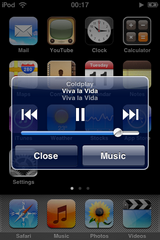
The music player can be controlled from just about anywhere in the iPod’s interface. Just double-tap the home screen to bring up a small dialog box. So far, the only screen I found where this doesn’t work is in Coverflow. See an example here.

Seeing the huge album artwork is always a treat – provided you actually bother to add the artwork in iTunes.

Coverflow also looks absolutely splendid, again thanks to the amazing screen.

Photos, Videos, and Safari: as expected

The photos app works just like the iPhone’s, except for the sending capabilities. The stretching and pinching actions will zoom in and out respectively, while photos can be viewed in either portrait or landscape mode by simply rotating the iPod itself.

The videos app, on the other hand, is a lot more primitive. Videos are always played in landscape mode, no matter the orientation. Still, videos look great on the screen.

The iPod is the first iPod to connect to the internet via Wi-Fi. Safari is one of the true killer apps on the device. Apple have included a stripped-down version, called Mobile Safari, specifically for the Touch/iPhone. Very little seems to have been left out.

The Touch offers an amazing, almost desktop-like browsing experience. Pages are rendered intact and it actually looks exactly like the web we know, not some “mobile” version. Safari can be switched to landscape orientation too. The zooming works just like in the photos application. I did miss the favicons though.

Not perfect: stupid Safari caching

One thing that annoyed me was the fact that there was some stupid caching at work. Every time you quit Safari and then brought it back up, it would reload the page you were just on. So you’d see it as it was for a second, then the screen blanks out to reload the page. This sucks, because if you suddenly lose your Wi-Fi connection and bring up Safari to finish that article you were reading, you’re out of luck.

YouTube, Calendar, Contacts, Calculator, Clock and iTunes store

The YouTube app functions exactly like the iPhone’s: well. It also sports great integration with Safari. Clicking a YouTube link will take you out of Safari and load up the video in the YouTube app.

Calendar, Contacts, and Calculator all work in a predictable way – albeit with the Apple-flair, and multi-touch goodness that you’ll eventually grow accustomed to.

The  Clock is a good-looking, yet typical, iPod clock. It has support for multiple clocks at once and also has functions for a stopwatch, timer, and an alarm with simplistic ringtones (using the built-in piezoelectric speaker).

The iTunes Mini Store is actually a very good representation of the full-blown Store in iTunes proper. It offers a featured section, an extensive top-ten listing of many categories, a find-as-you-type search, and a downloads area. Purchases are later synced up with your iTunes proper. Apple have made it ridiculously easy to buy songs on the Mini Store – and they’re counting on it.

In conclusion

I bought the Touch mostly because I needed Mobile Safari – but also because I was tiring of the substandard mp3 players I had been buying. The iPhone wasn’t yet legally available either.

I’ve grown extremely fond of the iPod Touch. It’s almost perfect. What makes this iPod so special is that it’s not just an iPod – it can do so much more. Beware though, with version 1 it can’t do nearly as much as the iPhone can. Version 2.0 gives you most of the iPhone apps at a price ($9.95).

Mobile Safari works amazingly well, as does the YouTube client, as well as of course the Photos and Videos applications.

You have to congratulate Apple on including such an amazing technology in this device. The multi-touch user interface really is light years ahead of anything else out there right now. It is easily the most responsive, slick user interface I’ve ever seen. Credit also has be given to the excellent level of UI consistency around the device.

Of course, we can’t forget that first and foremost the iPod is meant to be a music player – and in that department it excels. Features such as Coverflow make the experience even better. Sound quality is excellent, and the supplied earphones are okay for non-discerning ears. Volume was never as issue – you can go as high as you’ll ever need. I was impressed by how much 16GB can hold, it easily fit my entire library. Also, the marriage with iTunes is as seamless as ever.

If the iPod could just do a little more of the iPhone’s tricks with software 1.1.5 and fixed some niggling, non-critical bugs, then it might just get a perfect score.

Final Rating: 9.5/10
Continue Reading

Google Chrome ads on YouTube?

Adverts for Google’s web browser, Chrome, are surfacing on YouTube – the popular video-sharing service.

The adverts seen so far are appearing at the bottom of some videos, in the form of banners.

Surprising?

That fact that Google is using YouTube to advertise shouldn't come as a surprise. After all, Google does own YouTube.

What is really surprising is that they’re advertising something that isn’t yet out of beta mode – it hasn’t even reached version 1.0 yet! However, Google is known keep its products in perpetual beta mode.

Confidence by Google

One thing’s for sure. Using YouTube to advertise its new browser is a sign of confidence in its own product. Google seem to be placing huge faith in their web browser to deliver a better browsing experience.

Reaching out to average users

YouTube is a primary place to distribute ads, since it has enormous reach; and is typically visited by all sorts of users – including average, non tech-savvy users who typically stick to Internet Explorer.

Good for the industry

It has to be said, this can only be a good thing for the industry of web development. Google Chrome is highly regarded in terms of standards compliance and online security. Migrating users from the potentially more vulnerable Internet Explorer is always a good thing.

Continue Reading

How good is your Colour Knowledge?

Colour specialists x-rite have created a fun little test to assess how good you are at colour hues. You are given four rows with little colour boxes on them. You need to re-arrange the boxes to get a consistent flow from one hue to another. It’s easier to see this than it is to explain it, so go ahead and take the test.

The test then asks you for your age group and gender so it can compare you score to similar demographic groups. The score is a simple scale from 0 to 1000. Getting a zero means a perfect score, and anything between 0-99 is classified as good (high colour IQ). I got a 4, so I’m pretty chuffed at the good result!

(P.S. It’s filed under photography because I think it’s a good idea that a photographer has a good, working colour knowledge)

Continue Reading

Do you use Photoshop in Web Design?

When designing a new website, a designer’s most useful tool is a pen and paper to get those early sketches down. However, many designers propagate using Photoshop in their design stage.

Certainly in the early stages, it can be especially useful in helping to visualise the final design – all before hard coding it. This may be a time-saver, since you won’t have to fight with CSS elements and semantic HTML.

However in my view, I prefer to hard-code from the outset, thereby creating a reliable framework for the website to grow. Besides this, text and type just doesn’t look the same in Photoshop and your web browser. 37signals makes a very good case for not using Photoshop in web design – and it’s worth a read.

You can’t click a Photoshop mockup. This is probably the number one reason we skip static mockups. They aren’t real. Paper isn’t real either, but paper doesn’t have that expectation. A Photoshop mockup is on your screen. If it’s on your screen it should work. You can’t pull down menus in a Photoshop mockup, you can’t enter text into a field in a Photoshop mockup, you can’t click a link in a Photoshop mockup. HTML/CSS, on the other hand, is the real experience.

from 37signals

Do you use Photoshop in your design stage? Let me know in the comments! (photo via stock.xchng)

Continue Reading

Is the Nike Swoosh Important to you?

I recently purchased a pair of classic Nike Capri shoes, with a brown leather finish. I’m a huge fan.

Examining the design and the stitching, I can’t help but feel that without the signature Nike “Swoosh”, they’d lose a lot of the design quality. For fun, I made a mockup of what it would look like without the swoosh, and the result isn’t so impressive.

As predicted, the shoes end up losing that special design quality. While the look may be more plain and therefore lends to the retro look, they just don’t look cool anymore.

What do you think? Do they still look good without the swoosh?

Continue Reading

Cell Citation Notepad to Enforce Cell Phone Laws

I can't think of a better way to do a service for you and those around you than to punish/embarass rude mobile phone users.

These Cell Citation Notes are a great way to do just that - and in no uncertain terms too. While the notes themselves cost $4.50USD for a set of 50, it should also be possible to print them yourself at home.

It should be pretty fun to write up a ticket to give to the offender, detailing what they were doing wrong (the conversation section is pretty funny!).

Would you buy it? More importantly, would you ever pluck up the courage to hand these out? (via)

Continue Reading

2 Blogger Hacks to Enhance its Functionality

I’ll get this out of the way early: I love Blogger. It’s a great blogging platform. I’ve often been tempted to switch over to WordPress.org, but quite frankly, Blogger’s simplicity is hard to beat.

However, simplicity very often means a missing feature or two. Blogger is no exception. Its main problem is a lack of extendibility – and that it offers lesser functionality out of the box than other blogging platforms like WordPress.

So, below are two hacks that utilise jQuery, and provide some extra functionality to your Blogger-powered blog.

  1. Styling Author Comments

    Author comments need to be styled differently, period. Sadly, Blogger doesn’t provide us with any way in which we can style author comments using CSS selectors. It would add a nice touch to your blog if you could style author comments differently from the rest.

    Luckily, Jeremy Martin has produced some JavaScript code which is really easy to implement and will in turn allow us to style our author comment using typical CSS selectors.

    He’s published an easy-to-follow tutorial to get this job done. See it here. I’ve published two test comments on this post to check whether it works as advertised.

    Note: make sure you have enabled the Profile Widget. Go to your blog in Blogger, click Layout, and then Page Elements. Add the profile widget to your sidebar (not sure how?).

    Make sure that “Share This Profile” is ticked, otherwise the script won't be able to work.

    Like it or not, you have to enable the profile widget. Luckily it's trivial to hide it. Simply add the following line of code in the style section of your template:

    #Profile1{ display:none }
  2. Post Summaries

    Blogger has been neglecting this feature addition for a while, and I (along with many others) regard it as essential. The helpful team at BloggerBuster have come up with a very easy way to implement this feature using some more jQuery.

    Advantages include being able to adjust the length of the excerpt, and a customisable way of showing the rest of the post (either using an expander or using linking to the post page). Also, you don't need to go through the tedious process of editing every single post on your blog. This plug in works with what you've already got.

These two hacks will hopefully go some way to extending the functionality of your Blogger-powered weblog. Please note that too much JavaScript on a page can slow down its loading time somewhat.

Continue Reading

Win a $25 voucher to spend in ThemeForest

Enter a competition where you can win an instant $25 to spend in the marvelous new ThemeForest. Right here on Astute Photo!

ThemeForest is a brand new marketplace for buying and selling website templates and CMS themes for all sorts of products, including WordPress, Drupal, and Joomla.

Guised under the Envato umbrella, ThemeForest is destined to become one of the very best places to find all things “themey” (to use their terminology).

I recently got in touch with Collis (one of the founders) about covering his ThemeForest’s launch. He was nice enough to offer me a $25 voucher to give away to Astute Photo readers (in US currency).

I decided to host a competition to determine the winner of this voucher.

The Competition

I’ll pick a winner based on the best suggestion they can offer to help me improve Astute Photo. I have a special Suggestion Box set up just for this.

How To Enter

  1. Go through the blog and its articles
  2. Think up a suggestion
  3. Add a comment in the Suggestion Box, clearly stating that it’s an entry for this competition.

For me to count your suggestion, simply copy-and-paste this somewhere in your suggestion-comment:

Entry for ThemeForest competition: Best Suggestion

In more Detail

Here are the same steps in more detail, including some helpful tips

  1. Go through the blog
    1. Read a few articles and establish the type of posts I like to write about (got any great article ideas?)
    2. Look at the design:
      1. Form (how is it aesthetically?)
      2. Function (is the site functional?)
  2. Think up a suggestion
    1. Think about exactly what you would like to suggest (pin it down, don’t be vague)
  3. Write it in the Suggestion Box
    1. You have to submit it via a comment.
    2. Word it carefully, so that you leave me in no doubt what your suggestion is about.
    3. Make sure to mention the magic 6 words: “Entry for ThemeForest competition: Best Suggestion

What are the Rules?

There aren’t a lot of rules to follow. Just these:

  1. You have to write any entries for this competition in the Suggestion Box. I cannot accept entries to the competition anywhere else, not even in this very post.
  2. In order for your suggestion to be counted, you need to include this somewhere in your comment:
    Entry for ThemeForest competition: Best Suggestion
  3. You may make more than one suggestion. No limits on the amount of suggestions.
  4. Please sign the comment with your full name, and include some way I can contact you. Sadly Blogger doesn’t allow you to post your email address so it’s up to you. You can, for example, list your Twitter, WordPress, TypePad, AIM, LiveJournal, or your Google accounts.

Get suggesting now! Visit the Suggestion Box and leave a comment!

Continue Reading

Google Chrome gets an Update

Google Chrome, the newest web browser on the block has just received its first update.

There aren’t any technical details to be found about what the update brings. However on first impression it seems to be a bit more responsive. It’s also fixed the ‘:%’ crash which plagued the first public release.

If you entered colon sign followed by a percentage sign into the address bar, then Chrome used to instantly crash. Even hovering over a link containing the infamous ‘:%’ would cause it to crash. Thankfully the new build (Build 1798) fixes this issue.

There is still no fix, however, for the annoying trackpad-scroller problem. Basically, you can scroll down just fine, however it’s impossible to scroll up using the same method. This problem only exists on laptop trackpads – it works perfectly fine with a regular USB or PS/2 mouse.

How to Update Chrome

  1. Click the wrench icon (top right corner)
  2. Go to About Google Chrome.
  3. If your version is outdated, you should have an Update Now button next to the OK button. Click that to initiate the update.

No word on the Google Chrome blog yet about this update.

Note: An in-depth review of Google Chrome is coming up. I’m giving it a bit of time to sort out the kinks, growing pains, and fix a couple of known issues.

Continue Reading

Google enters browser wars with Google Chrome

As I write this, it’s just hit midnight over here and so today is the official release date of Google Chrome (it’s not, see update 2). Google Chrome is a new open source web browser.

Update: Chrome now available. See update 3.

Developed completely in-house, Google Chrome makes some pretty bold claims about being faster, better, and being built for the future.

They’ve also released an entertaining comic book to guide us through some of the amazing new features that Google Chrome is planning to offer:

  • A multi-threaded approach, similar to the way modern operating systems work. This will mean faster page loads.
  • Running each tab in a separate process, therefore it promises to be more memory efficient.
  • A task-manager for handling different tabs. This will enable you to see which tabs are using the most memory.
  • An advanced rendering engine, combining the best of both Firefox’s Gecko and Safari’s webkit technologies – regarded to be the best in the business of rendering web pages.
  • A completely redone JavaScript engine called V8, which promises blazingly fast JavaScript rendering. Firefox 3 is currently the fastest renderer, will Google Chrome beat it?
  • An intelligent URL bar, called the “Omnibox” – similar to Firefox 3’s awesome bar.
  • Each tab is sandboxed, meaning that a tab cannot by itself initiate commands and execute software. This is a nice improvement in security and should result in safer, more secure browsing.

There are a couple of features I haven't mentioned. I recommend you give the comic a good read through to find out about all the new features.

I’m personally very interested in this. As much as I love using Firefox and all its extensions and skins, it does get to be a memory hog at times. Plus I always appreciate faster page loads.

I’ll update when Google Chrome becomes available for public testing, which should be in a few hours. This software is at this point for Windows only.

Update: Google had posted screenshots at gears.google.com/chrome. However this was quickly taken down and now redirects to the Google homepage.
Update 2: Just read that the official release date is slated for the 3rd of September. It’ll also be released to just 100 countries worldwide. So not only do we have to wait for at another day, but it might not even be available here in Malta. Boo!
Update 3: GOOGLE CHROME NOW AVAILABLE FOR DOWNLOAD… and it’s everything I hoped for. Initial speed tests place it far above even Firefox and Safari.

Download at google.com/chrome

If that doesn’t work for you, I’ve set up a temporary mirror which you can download Chrome from. To download click here.

It imported all my Firefox bookmarks and settings seamlessly. It even placed the stuff in its own bookmarks toolbar just like the way I’m used to from Firefox. It also imported the home page, and all my saved passwords.

A full review is forthcoming.
Continue Reading

Cool CSS Tooltips

If you’re reading this from an RSS feed, you’ll need to switch over to the web page (the CSS is in the head section, and thus isn’t loaded by an RSS reader)

In this tutorial you’ll learn how to make some really clever CSS-based tooltipsAnd it's actually really easy!.

The most basic way to create a tooltip from a link is to use the title attribute in a link. This small bit of text is displayed in a small box.

A tooltip is often used to explain outgoing links. A simple, unobtrusive tooltip is often all we need to use in our site design.

However what if we wanted to explain something further, or we wanted to add some formatting to our tooltip? Browsers differ in the way they display tooltips, and they differ even further if they spread across multiple lines.

Note that this tutorial assumes that you have a basic understanding of HTML and CSS languages.

Using the span tag to hide text

  1. First thing you have to do is remove any extra title attributes you may have on your link, so that it doesn’t interfere with our CSS tooltip.
  2. Insert the tooltip right after the link text, and enclose it in a span tag, like so: HTML
    <p>
        Check
        <a href="#">this <span>This is tooltip text!<span></a>
        out!
    </p>
  3. Now we need to style this. We should first hide the text inside the span tag:CSS
    a span {
        display: none;
    }
  4. By using the pseudo-class :hover, we can make sure that the text will show only if the user hovers the mouse at our link. We are basically telling the browser: “Change the display from none to block when the user hovers over a link”. Our CSS should now look like this: CSS
    a span {
        display: none;
    }
    a:hover span {
        display: block;
    }
  5. If you try to run your code now, you’ll notice some serious problems. The span element will act like a block and therefore push everything after it downwards!

    How are we going to get the span to appear without interrupting the page flow? We must use absolute positioning to get this. This way, it will have no effect on other elements, except for covering part of them. I’ve also applied some basic styling below to make it look more like a tooltip: a:hover span {
        position: absolute;
        display: block;

        /* styling */
        background-color: #323232;
        color: #FFFFFF;
    }
  6. Even though it’s looking more and more like a tooltip, right away you’ll notice some positioning woes. This is because of the absolute setting that we had to use before.

    To position it properly, we have to turn the link itself in to an anchor that the absolutely positioned span element can work from. To do that we have to set relative positioning on the link.

    In addition, we should also add some absolute positioning by specifying the top and left attributes. Also, we need to ensure that it’s always on the top. To do this we need to add a z-index attribute.

    This is how our complete CSS should look (syntax highlighting and all :)
    CSS
    a {
        position: relative;
    }
    a span {
        display: none;
    }
    a:hover span {
        position: absolute;
        display: block;

        /* positioning */
        top: 30px;
        left: 30px;
        z-index: 100;

        /* styling */
        background-color: #323232;
        color: #FFFFFF;
    }

Extending the concept

This hover/popup method is very powerful and can be extended towards all sorts of things. You can apply certain “tooltip” classes and even apply some HTML on the tooltip. For example, you can have an image gallery, and a larger version of the image pops up in the tooltip. Remember that they don’t even have to be linksSince you don't specifically need the link tag (hover your mouse over the bold text!)

The original concept for the hover/popup CSS method was first shown on Eric Meyer’s website. Thanks, Eric!

Continue Reading

9 beautiful Sony Ericsson themes

Sony EricssonGo to sonyericsson.com mobile phones are very extensible devices, they can be extended by Java applications, and they can also be skinned – ensuring that no two SE phones have to be the same ever again.

Naturally, SE phones have a vibrant creative community, and so there’s plenty of free themes to choose from. Ever since I got my K610iK610i homepage, I’ve been looking high-and-low to find my favourite. Below are nine of my favourites in no particular order.

Editor’s Note - Note that the display resolutions on Sony Ericsson phones vary. This means that while (e.g.) themes designed for 240x320-pixel screens will still work on (e.g.) 176x220-pixel screens, they won’t be specifically designed for that screen. Proceed with caution.

Windows Live

Windows Live is a well-designed theme that aims to mimic the look and feel of desktop-based Live applications. It’s designed for 176x220-pixel screens, such as the K550 and K750.

AquadromeXT

A very nice collection of five themes in 5 different colour schemes. My favourite is the lime-green one. As with Windows Live above, it’s designed for 176x200-pixel screens.

Glazz

A gorgeous glassy theme with lots of green. There’s a huge compatibility list, so you’re very likely to find a matching version.

Aero Glass

Another glass-inspired one. A very sharp theme with a dark flair. Rough in places but top work overall. Appears to be designed for 176x200-pixel phones (judging from screenshots - no details given).

iPhone

This iPhone theme attempts to mimic the look and feel of the real device. I have to say it’s a very nice job. I love the little “X” on the small dialogs. It also includes the ringtones. Designed for QVGA (240x320-pixel) screens, such as the K800i. Big download, this one.

iAurora

One of my highest-rated themes. A beautiful combination of a soft background and delicate colours. Lovely. Designed for 176x220-pixel screens.

The Green

Also available in red and blue. A very modern theme with loads of life and energy. Designed for QVGA (240x320-pixel) screens, but works well on a smaller screen.

Bolino

Despite the strange name, this is a solid theme with nice shades of blue. Designed for 176x220-pixel phones.

Chocolate

A gorgeous theme with lots of neat touches and flourishes. Beautiful shades of brown. Designed for both QVGA, and 176x220-pixel phones.

Got your own favourite theme for your mobile? Did I leave out a great theme? Let me know in the comments!

Continue Reading

Apple Beats Microsoft in Font Rendering

When Apple introduced its Safari browser for Windows, I for one, realise what I’ve been missing. And no, it’s not the “authentic Apple experience” which I dont buy into. It’s the font-rendering.

Windows Internet Explorer font rendering:

Safari font rendering:


Even with ClearType turned on in Windows Vista, I think it just doesn’t look as good. Fonts look bolder, and more like they’d be if they were printed.

Microsoft has its own font-smoothing technology called ClearType, it was designed with the intent of screen-reading. In fairness, ClearType is a massive improvement over the regular Windows font-smoothing. However, Mac’s own font-smoothing technology just looks better.

ClearType’s problem isn’t so much a problem as a different philosophy. Apple wanted to accurately replicate the fonts we see when printed, and Microsoft made it easier to read things on screen.

Both systems have their advantages. Over a long period of extended use, I think Windows’ rendering might just have the edge, and many agree. However Safari’s level of font-smoothing can be reduced. I have mine set on medium.

Every time I load up Safari to check rendering issues, it just looks better. While it may not be as readable, it makes text so much more beautiful.

Disagree? Have something else to add? What do you think? Let me know in the comments.

Continue Reading

Notepad2 (featured freeware)

This series takes a look at some of the best free software available on the World Wide Web.

The default plain text editor on Windows is called Notepad, and hasn’t had any major changes since its inception way back in 1985. Up until Windows 95, there wasn’t even a choice of fonts! Only Fixedsys was available.

However people today still use it on a daily basis because it offers fast, simple plain-text editing on the go. Just double-click on the file, change one or two things, Ctrl+S and we’re done.

It’s particularly popular among programmers and web-coders. But everyone is also aware of its many limitations. It doesn’t have auto-indent support, doesn’t support syntax highlighting, bracket matching, and other features such as regex-based find-and-replace.

Enter Notepad2

This is where Notepad2 steps in. Written by Florian Balmer, it is a free notepad-like app with the intent of replacing the original Notepad for day-to-day text slinging.

Besides having all the features mentioned above (the original Notepad’s limitations), it is also extremely fast and super-easy to use.

The deal-maker for me was the fact that it:

  • Supports automatic indentation
  • Has bracket matching
  • Supports syntax-highlighting for every major programming/scripting language out there. It recognises simple Java files, CSS, XML, and HTML files, and last time I was creating an Apache config. file, and it even recognised that
  • Has a multitude of customisable options and configurations to make it work exactly the same way you do.

Not once has Notepad2 let me down. Its features are almost perfect and it’s super fast. I also love the fact that it doesn’t support a multi-document interface. This is great because it’s simply meant to be a notepad replacement, not a full-featured IDE.

Download

Extra: Replace notepad.exe with Notepad2.exe

There would understandably be a great demand for this hack, since it would enable you to double-click on a text file and have Notepad2 take care of your editing work. No more right click > open with… > Notepad2.

Luckily, there is a solution! Try this hack, and if it doesn’t work, try a Google search.

Got a favourite editor you use? Perhaps you use the popular Notepad++ instead? Let me know in the comments!

Continue Reading

Innovative clock screensavers

In the past, the role of a screensaver was very important. It was invented to prevent screen-burning. Very old CRT monitors were susceptible to having areas of the screen ruined by displaying non-moving text and graphics continuously for long periods of time. The screensaver’s job was to either blank the screen or fill it with moving images or patterns when the computer was idle.

Nowadays, screensavers are used for entertainment. Modern monitors don’t suffer from screen burn and so we don’t have a real use for them anymore.

Many people also use their screensavers to tell them the time. However, the default screensaver-clock isn’t very appealing at all to look at (at least in Windows).

Terribly ugly isn’t it? Luckily, there’s quite a few innovative clock ideas you can choose from (prepare to scroll…)

Word Clock

Word Clock is one of those gems that you had no idea existed, but when you find it, wish you had found it years earlier.

This screensaver’s design is an absolute masterpiece. Every second, the clock updates. For example in the picture above, the highlighted “fifty-seven” will go back to grey and the “fifty-eight” next to it will highlight itself in red.

Another intriguing option offered by Word Clock is the rotary version. It has a similar feel as an old analog clock.

Everything about the screensaver is customisable – from the typeface to the colours, the size and position to text-transformations (uppercase, lowercase), making it three times as useful.

Fliqlo

This is a much simpler design than Word Clock, however it is still a very nice and simple design. It is also extremely light on system resources.

As for customisation, there isn’t much. The good news, however, is that it’s integrated into the screensaver itself. When the screensaver’s playing, hit the up/down arrows to change zoom or the left/right arrows to toggle between 12 or 24-hour clocks.

  • Download Fliqlo (available for Windows and Mac OS X – choose the left-most cassette)

PolarClock

PolarClock takes a very unique approach and presents its information in a beautiful set of coloured concentric bars. The bars change colour depending on the position they’re in.

Be warned, however, that this isn’t light on system resources. My relatively lightweight system (1.8GHz, 2GB RAM, Mobile Intel Graphics) struggled to cope with PolarClock.

Further reading

Continue Reading

PDF Tools, Tips, and Resources Collection

An excellent set of PDF bits has been posted up at Honkiat. It’s a very comprehensive, feature-everything kind of post (80 tools are featured). It’s extremely useful and will, without a doubt, still be useful years later.

What are PDFs?

PDFs are a very useful file type. It’s used to send around electronic documents — such as forms, reports, legal stuff, and even advertising material.

PDF is a great format because it presents the documents exactly as you see them. A PDF will appear the same on your work computer, your home laptop, your PDF-reading smart-phone, literally everywhere, custom fonts and all.

Continue Reading

Suggestion Box

  • Got a great suggestion that you think I’d like to read about?
  • An idea for an article, for a “how it’s done” tutorial, or even a feature?
  • A feature you’d like to see implemented?

In an effort to make the content even more relevant, this post will serve as a suggestion box. Simply leave a comment on this very post. Every suggestion will be responded to in kind.

Your Opinion Counts

So make it count to me! Suggest something to me today. Use the comment form


Note: The Suggestion Box is now playing host to the ThemeForest competition.

To participate, read the submission rules and submit your best suggestions in this post’s comment form.

Be sure to quote the following somewhere in your suggestion: “Entry for ThemeForest competition: Best Suggestion
Continue Reading

9 Firefox Extensions I couldn’t live without

I’m a bit of an extension-addict. While I worry that my Firefox will slow down, I worry even more that I’m not fully making use of all the capabilities that Firefox can offer me.

What’s Firefox? In case you’ve been living under a rock (or just aren’t tech savvy), Mozilla Firefox is a web browser. You use it to view websites, just like Internet Explorer, only much, much better, in every way.

In the list below, I’ve listed 9 extensions which I use in varying frequencies.

Note: While these extensions work for me, I couldn’t imagine that I use the same as everyone else. This is just a personal list.

Critically important

Here are 3 ultra-important extensions which I use daily to help me get work done.

1. Firebug
It’s fair to say enough’s been said about this one extension that whatever I add is already redundant. It makes web-development fun again. It offers things like real-time editing of things like CSS, a powerful Javascript debugger and console, and a way to inspect and edit HTML.

I use it in a very simple way. When editing a site, I simply create a basic CSS style, load it in Firefox, hit F12, click Inspect, and I’m in the money. In plain terms, if you do web-design, then you have to get this.

2. Foxmarks

A lifesaver if you have more than one computer. Foxmarks makes it amazingly simple to have the exact same set of bookmarks across computers running Firefox.

Essentially - you create an account, and it stores your bookmarks on a secure server. Then Foxmarks will download the stored bookmarks and merge them with your current set (or it can simply replace everything). Every time you edit your bookmarks (e.g. adding a new one or re-ordering them), Foxmarks will silently back them up to its servers.

As an added bonus, you can access your bookmarks anywhere by going to http://my.foxmarks.com and entering your username and password.

3. IE Tab

Does what it says on the tin, and quite brilliantly too. Need to test a site in Internet Explorer? Hate using Internet Explorer? Try this.

Successfully runs Microsoft Update, and even Active X controls. A saviour for those sites who don’t fully work with Firefox. Excellent extension.

Very useful

I also use these 4 extensions very often. They save me quite a bit of time and are just plain helpful.

4. CoLT
Short for “Copy Link Text”, CoLT does its relatively simple job spectacularly well. It makes it “easier than ever to copy a hyperlink’s associated text”. Visit the home page for a better-explained article at what it can do.

5. FireShot
It offers both a free and a pay version. The free version is very useful for my intended use. It basically offers the ability to create screenshots of webpages, both the visible area, or the entire page. Fireshot offers a variety of ways of saving your screenshot – I often just save it to the desktop or onto the clipboard. It also offers annotation and editing tools although I seldom use them.

6. Firesizer
A very handy, tiny extension which displays the current size of the Firefox window, and allows you to resize the window according to pixel-dimensions. Firesizer is useful for testing fixed-width layouts.

7. Flagfox
Ultra-useful addon for displaying information about a website – including location (using Google maps) and server information.

Handy

Here are 2 extensions which I find useful from time to time.

8. UnMHT
Empowers Firefox with the ability to save and write MHT files, a standard used for saving complete web pages.

9. Opanda IExif
Requires you to install the excellent IExif program first. This Firefox extensions offers right-click access to a photo’s EXIF information.

Continue Reading

FF Nuvo (featured freeware)

FontShop, world-renowned for producing some of the world’s best-designed fonts, has released FF Nuvo as a freebie for a limited time only.

The font file is a medium-weight, OpenType font. Here’s a short description of the font:

FF Nuvo has a soft, calligraphic touch. Its small caps, multiple figure sets, and italics make it a useful family for editorial, advertising and packaging. Its alternate glyphs add typographic versatility.

Here’s a specimen:

Note: Type specimen created by me, using material from a random sentence generator.

Download

Update: 12-Aug-08

Installing Fonts

I realise that some readers may not know how to install fonts on their system. Below are some instructions for a few operating systems.

  • Windows Vista: Right click “NuvoOT-Medi.otf” and click Install
  • Windows XP: Go to Start > Run > type in “fonts” > drag-and-drop “NuvoOT-Medi.otf” to the Fonts folder
  • Mac OS: Drag and drop the font into the Fonts folder in the Library folder
  • Linux: Depends on distribution (this might help).
Continue Reading

Revo Uninstaller kills stubborn programs (featured freeware)

Use Revo Uninstaller to uninstall those pesky programs that just won’t leave. After using this, you’ll never find a need for the old, clunky default Add/Remove Programs tool in Control Panel.

Revo Uninstaller can remove all traces of a program’s existence, thus speeding up your computer and saving disk space. Even when programs uninstall correctly, they still leave traces of their existence in hard-to-reach places like the registry and your App-Data folder.

Hunter Mode

There’s also a super-useful mode called Hunter Mode. Simply drag the Hunter over an icon, an item on the taskbar, or even a System Tray icon, and Revo will work its magic.

There are plenty more features for you to try out.

Highly recommended!

Continue Reading