The site utilises smooth automatic scrolling and has no page loading – since it’s all technically on the same page. It looks great in action. Here are some screen shots:


Check out their site at YouLove.us
The site utilises smooth automatic scrolling and has no page loading – since it’s all technically on the same page. It looks great in action. Here are some screen shots:
Check out their site at YouLove.us

Certainly in the early stages, it can be especially useful in helping to visualise the final design – all before hard coding it. This may be a time-saver, since you won’t have to fight with CSS elements and semantic HTML.
However in my view, I prefer to hard-code from the outset, thereby creating a reliable framework for the website to grow. Besides this, text and type just doesn’t look the same in Photoshop and your web browser. 37signals makes a very good case for not using Photoshop in web design – and it’s worth a read.
You can’t click a Photoshop mockup. This is probably the number one reason we skip static mockups. They aren’t real. Paper isn’t real either, but paper doesn’t have that expectation. A Photoshop mockup is on your screen. If it’s on your screen it should work. You can’t pull down menus in a Photoshop mockup, you can’t enter text into a field in a Photoshop mockup, you can’t click a link in a Photoshop mockup. HTML/CSS, on the other hand, is the real experience.
from 37signals
Do you use Photoshop in your design stage? Let me know in the comments! (photo via stock.xchng)
I recently purchased a pair of classic Nike Capri shoes, with a brown leather finish. I’m a huge fan.

Examining the design and the stitching, I can’t help but feel that without the signature Nike “Swoosh”, they’d lose a lot of the design quality. For fun, I made a mockup of what it would look like without the swoosh, and the result isn’t so impressive.

As predicted, the shoes end up losing that special design quality. While the look may be more plain and therefore lends to the retro look, they just don’t look cool anymore.
What do you think? Do they still look good without the swoosh?
Uh-oh. You’ve reach a web site’s 404 page. What is this? Is it the web site’s fault? Is it mine? Is this temporary or permanent?
A 404 is a standard HTTP error code to signify that the web page you were looking for doesn’t exist. We also refer to them as dead-links.
Most of the time you’re met with an unfriendly error message that goes along something like this:
The requested URL was not found on this server. Additionally, a 404 Not Found error has occurred.
What would be the first thing you’d do when you see this? You would simply press the back button and be on your way, of course.
This is problematic for the site owners because they would have lost another visitor.
However all’s not lost. Web developers have to option to create a custom 404 error message. All they have to do is modify the “.htaccess” file and add the following line of code to the top:
ErrorDocument 404 http://www.example.com/404.html
Obviously, change the example URL to where you’ve hosted the custom HTML page. You can name it whatever you want.
Designing beautiful, well-constructed and intuitive 404 error pages has always been tough work. We’ll now take a look at some examples of 404 pages, some good, some bad, and some great. Prepare to scroll…
(Disclaimer: The following sites were picked at random from my favourites list. I do not intend to pick on, insult, or defame any of the web sites listed here.)

Twitter’s 404 error page is pretty much superb. They’ve put in a very handy search bar and links to the home page, the help page, and even the support page. Kudos to Twitter then!
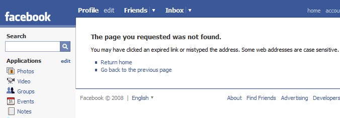
Facebook’s 404 page is similar to Twitter’s however the layout of the page isn’t as intuitive and there’s no support page link. Overall though pretty serviceable.

GSMArena’s 404 page is horrible. No extra information given and definitely no friendly error messages here.

dpreview’s page isn’t great either. They have no search box and a pretty unhelpful message. At least they put a link to the home page.
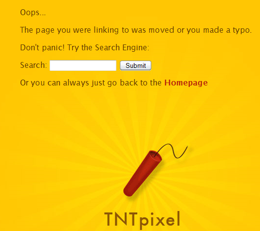
TNTpixel’s 404 page is my all-time favourite. It’s got the familiar bright colouring associated with the site, it’s got a very friendly error message, and a very effective search box (try it out).

Much as I enjoy the many novel features Facebook enjoys over other social networking sites, I don't appreciate its interface at all. Despite it having a user interface quite a bit better than its rivals, it still isn't good enough. Here are two of my biggest gripes…
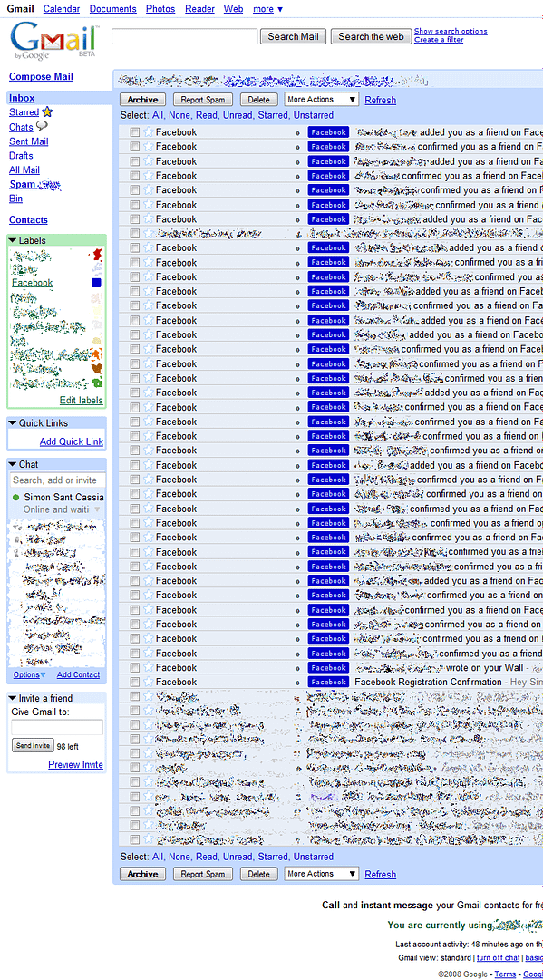
My biggest complaint is actually related to the way it handles email notifications by default. It will typically send you every notification it possibly could, immediately after it happens. This is what my gmail inbox looked like after 24 hours of joining: (click to zoom in)
At least, there is an easy way to at least reduce the amount of emails Facebook sends you. Click on the “Account” link on the top-right, and then go to the “Notifications” tab. Alternatively, here’s a direct link if you’re already signed in. You’ll find a list of options that enable you to easily reduce the level of clog in your inbox. Think about removing notifications for new friend additions.
When adding new friends, for example from the “People you may know” section, it’s reasonable to assume that before adding someone, you’d want to make sure it’s the right person. You’d want to look at their photos, etc. Sadly you need to be their friend to do these things.
I can understand why Facebook would want to stop users from visiting non-friend profiles; stopping spam, etc. However couldn’t they have implemented a privilege system, where only friends could view and comment on walls and see private contact info, but photos and a bio was accessible to everyone? (turns out they have - it's optional) I was extremely frustrated when a friend sent me a link to view their photos, but I was confronted with a login barrier. Since I didn’t have an account, I couldn’t do anything but turn back.
The heading pretty much sums up my experiences so far with Facebook. Did I mention how much I love the apps feature?

Hi, I'm Simon Sant Cassia, and welcome to Astute Photo.
This is a blog about things like photography, reviews, freebies, web design, editorials, and just stuff I find. Be sure to subscribe to the RSS Feed so that you don't miss out on future articles! (photo via)
Be sure to subscribe to Astute Photo.
You can subscribe either via:
- grabbing the RSS Feed, or
- getting Email Updates


Following a blog via its RSS Feed is the best, most efficient way to keep up with the latest articles.
What is RSS? See a video explanation in plain English.